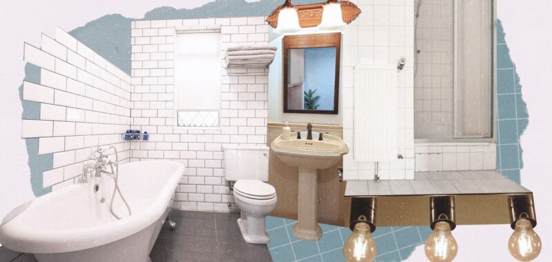
Even to the untrained eye, it’s easy to spot a dated bathroom. Features like foiled wallpaper, burnt sienna tile, and honey-wood vanities are often dead giveaways of the ghosts of bathroom trends past. But what about the less obvious things that detract from a modern-day bathroom? Are there subtle stylistic choices that should be avoided for a remodel? According to interior designers and home experts across the country, the answer is yes. Ahead, they reveal the seven bathroom trends that could be making your space unpleasantly out of style.
1. A matchy-matchy look
Photo: Bravo/Getty Images
According to Ashley Ferguson of Ashley Ferguson Interiors, nothing dates a bathroom faster than overly matchy, mass-produced selections. She asks, “Remember when the wood tone from the vanity ‘had’ to match the mirror’s wood frame? Or when all the metal finishes ‘had’ to be the exact same? Those days are gone, and thoughtful selections and custom features are in.” Ferguson argues that a bathroom’s design, like any room in the home, should be an interplay of textures, colors, and materials that complement one another in a fresh way.
2. Subway tiles
This ubiquitous tile may only belong in one spot: subway stations. “At one point, subway tile was a big bathroom design trend, but its overuse and minimalist design has made the feature feel outdated,” says Newport Beach, California–based interior designer Lindye Galloway. “While the tile can be great for maintaining cohesion, it doesn’t add anything exciting or eye-catching to the space, especially compared to the unique colors, patterns, and textures of the styles we’re seeing more of in bathrooms nowadays.”
3. Old vanity lights
You know those bulbous lights perched above a bathroom mirror? Time to nix those, says Mackenzie Wood, partner and lead designer at Tribe Design Group in Austin. “Personally I hate any lighting over a mirror; it’s just not flattering!” she says. “So I usually opt for sconces at face height instead in our designs.”
4. All-white or all-beige palettes
Photo: Houston Chronicle/Hearst Newspapers/Getty Images


.jpg)
.jpg)